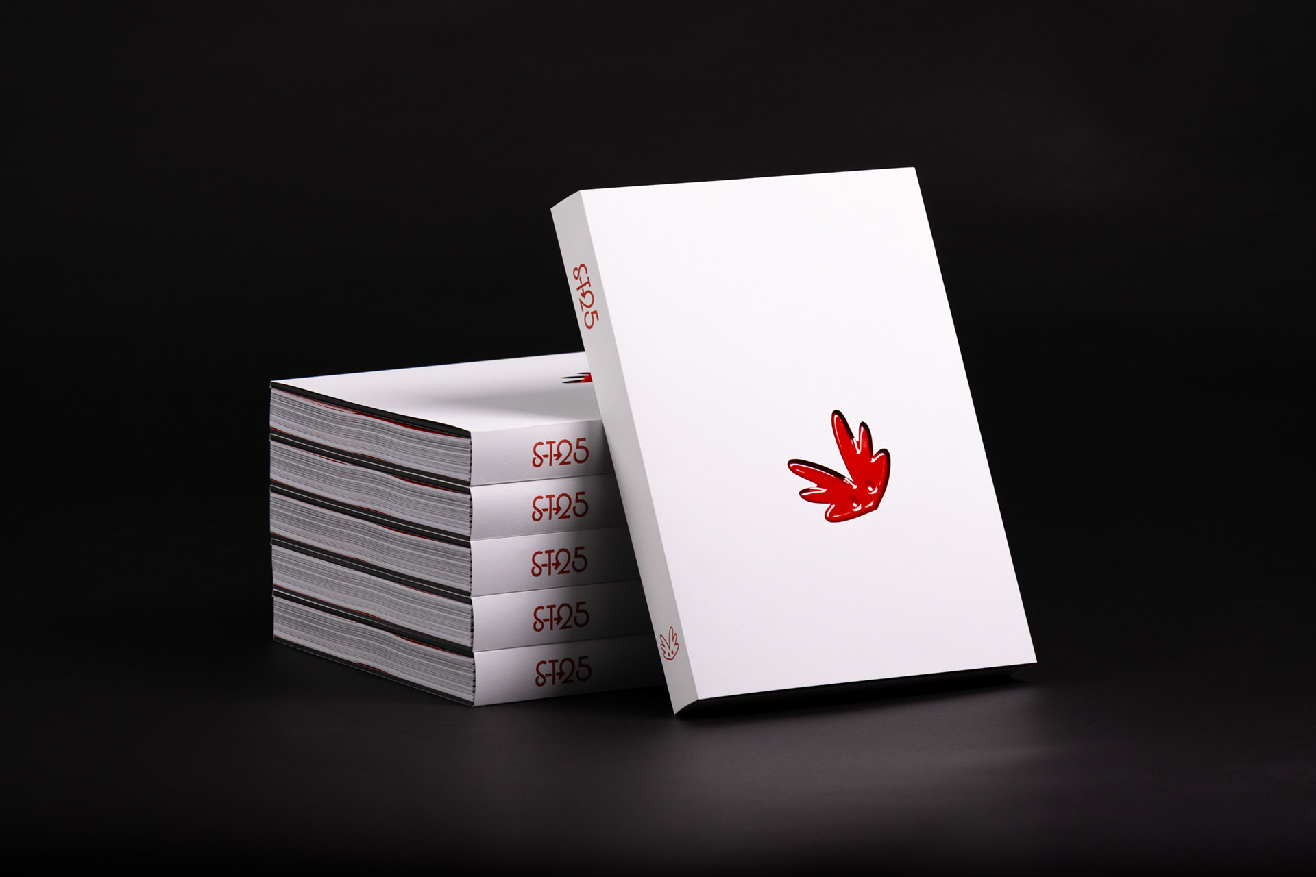
As Publication Designer, I oversaw a small team of Students and Teachers to plan, manage and execute this project. We generated over 250 pages of content, and working with a specialised local printer, brought our concept to life with premium materials.
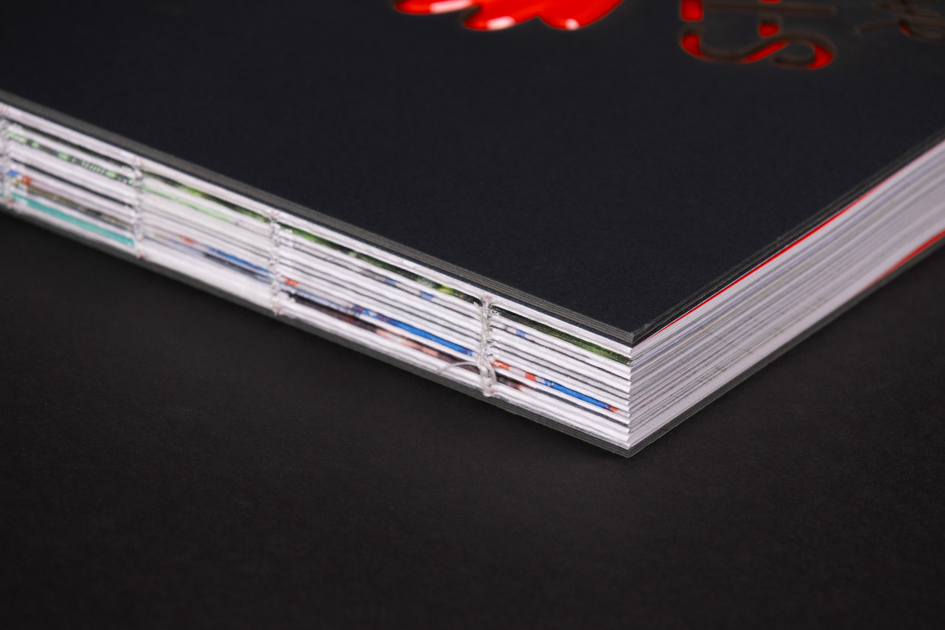
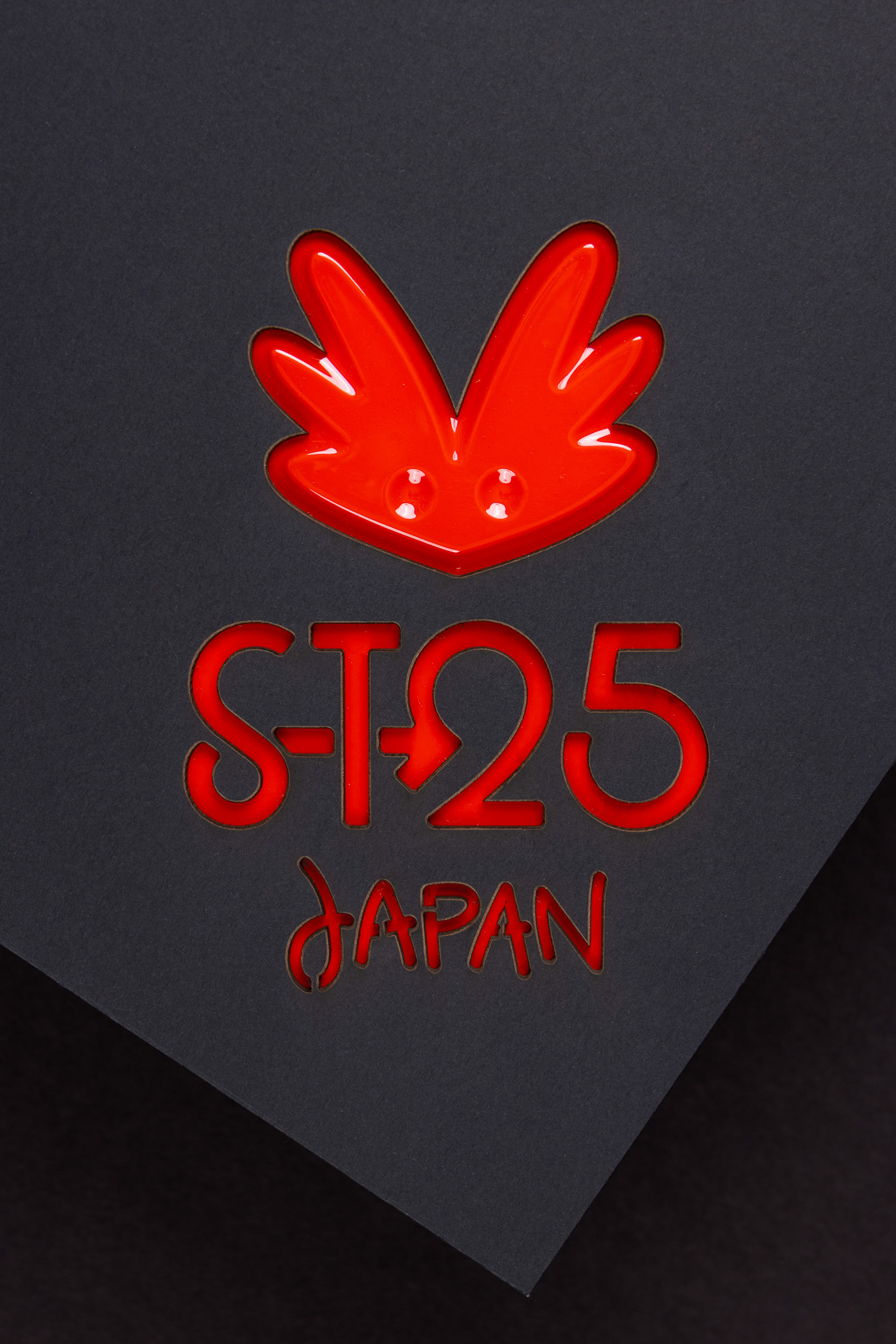
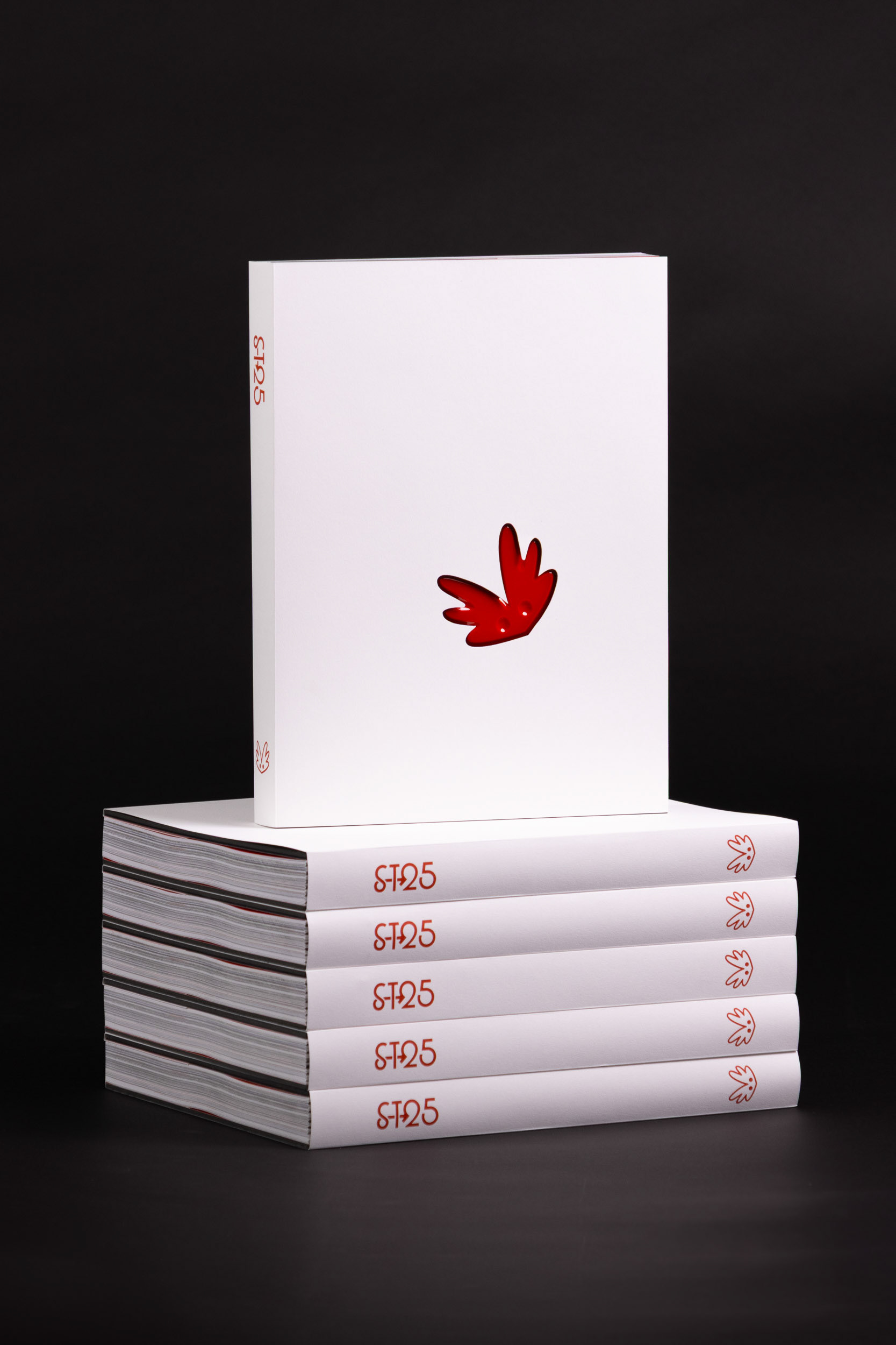
In collaboration with the RMIT workshop and Product Design teacher Jansen Lye, we developed a cover concept that features a vacuum formed insert and laser cut window. These parts were produced in house at RMIT and supplied to our printer - requiring me to negotiate complex setup and file delivery with many moving parts.
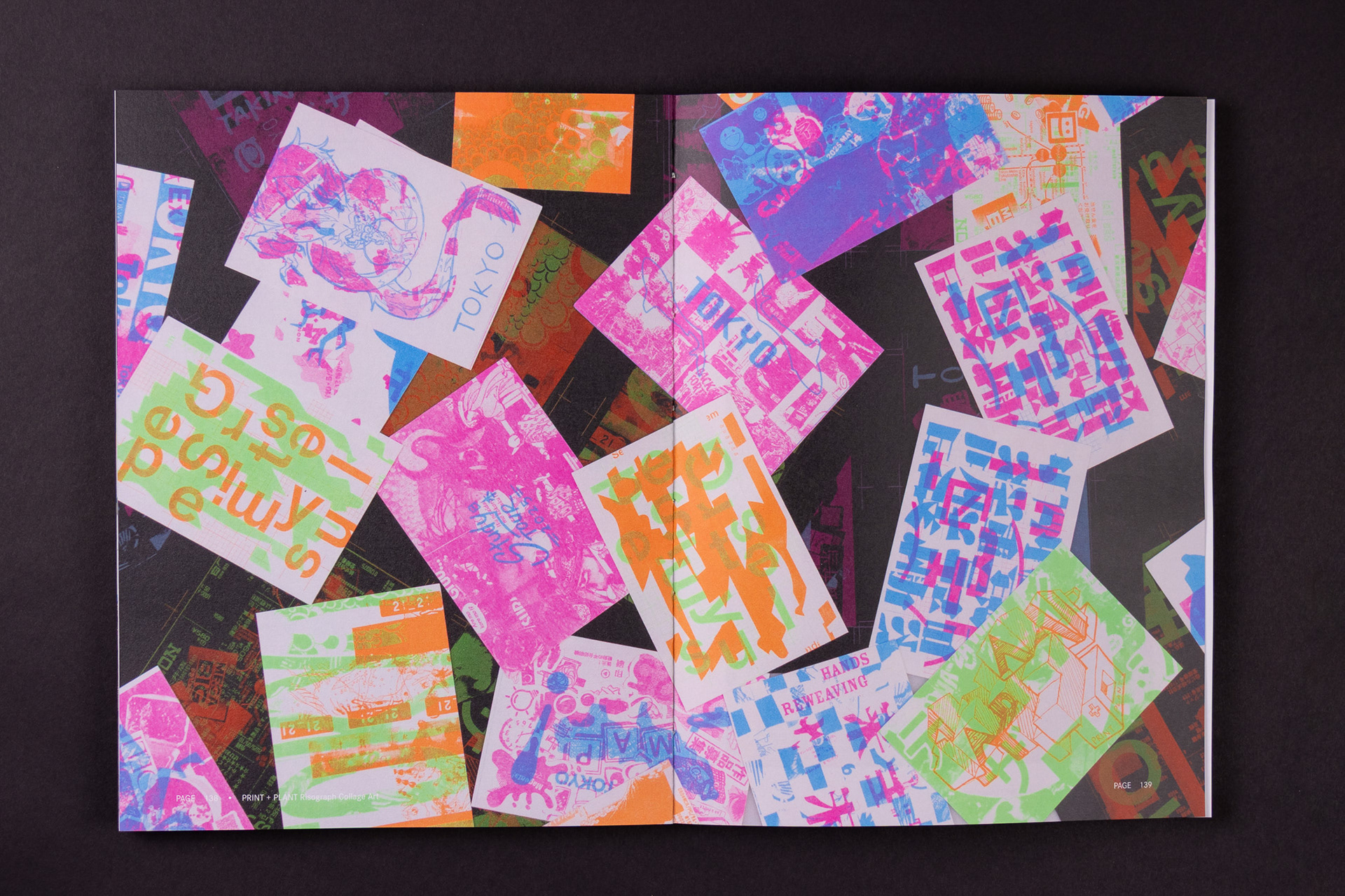
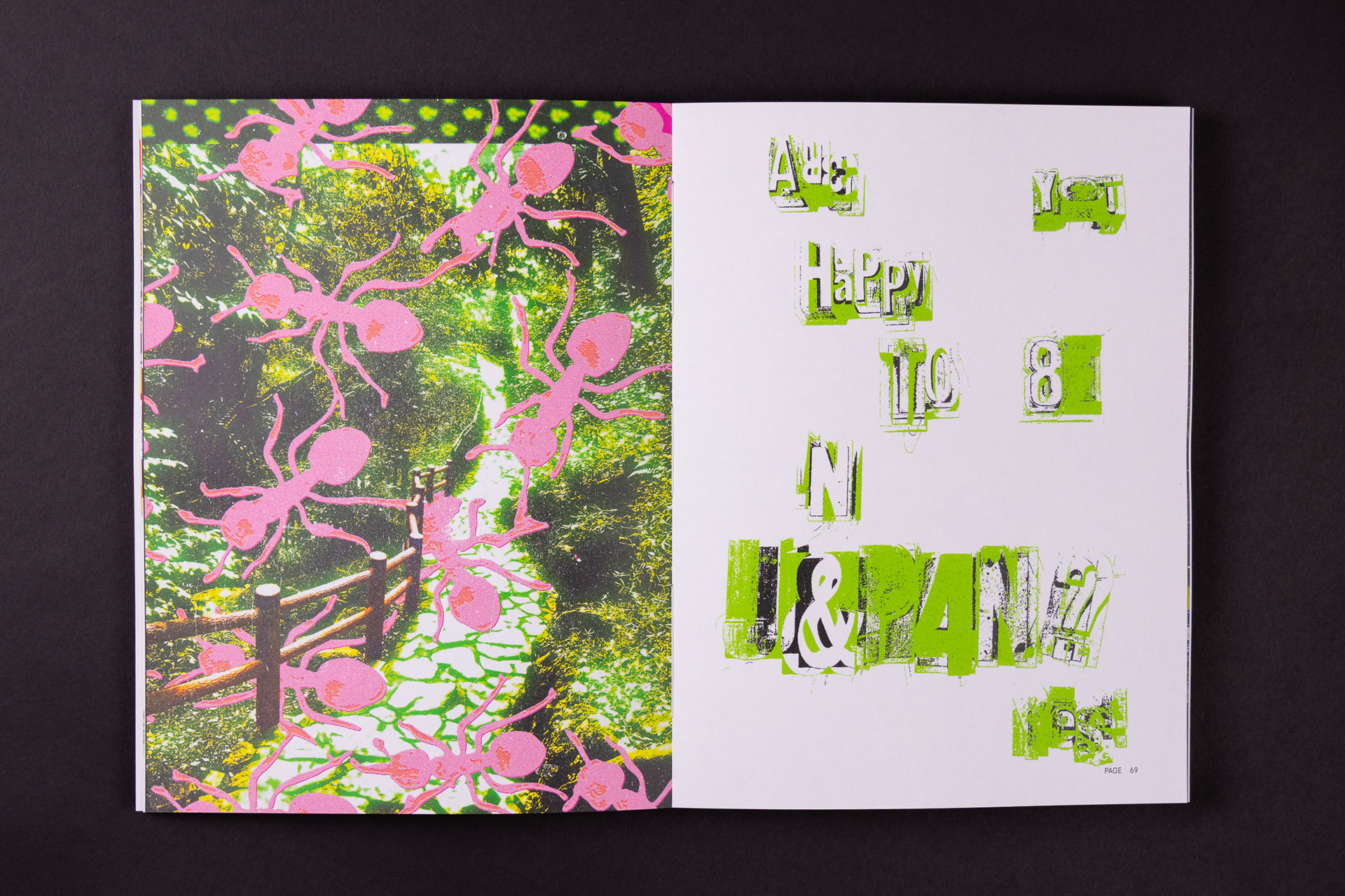
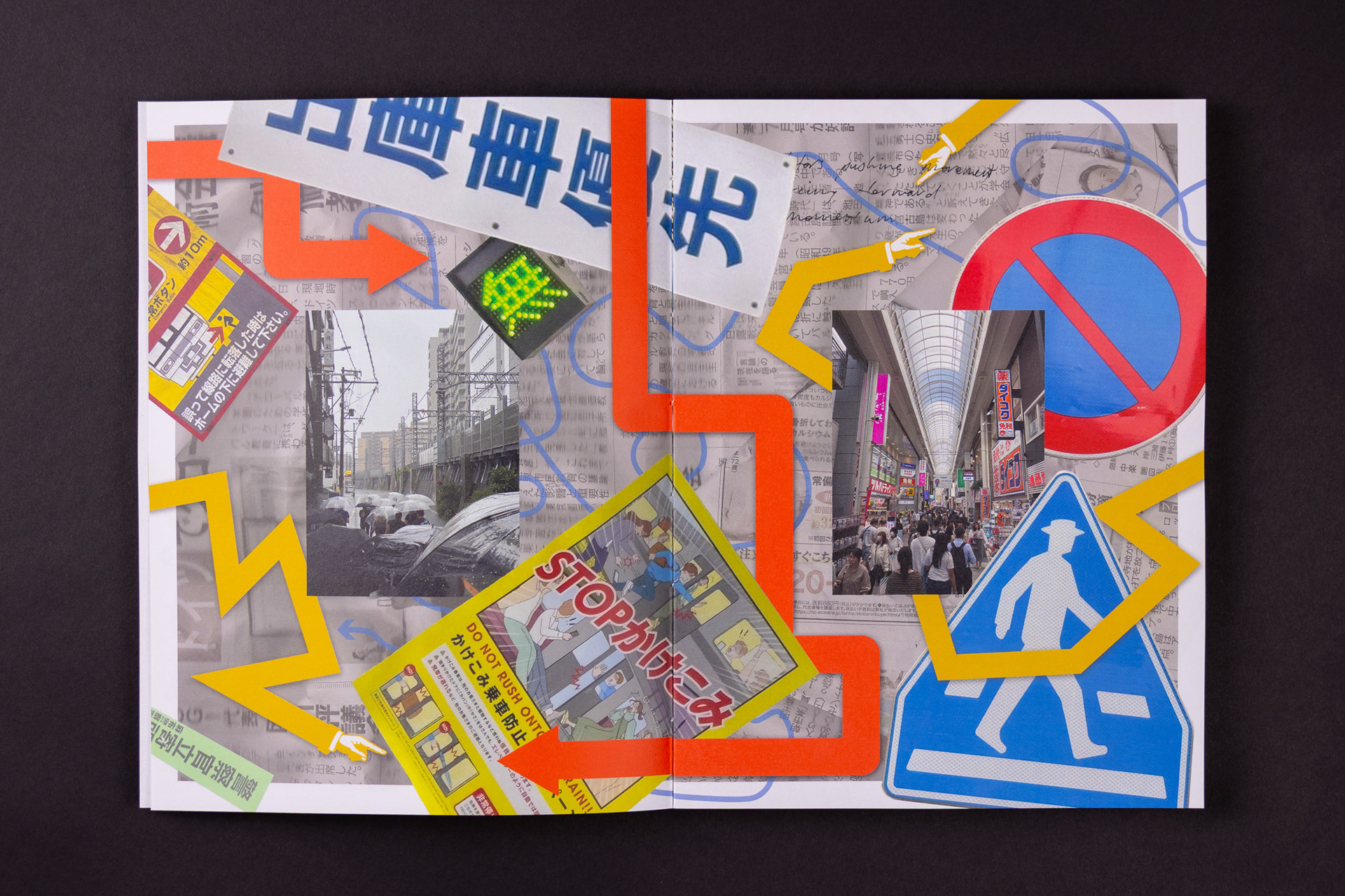
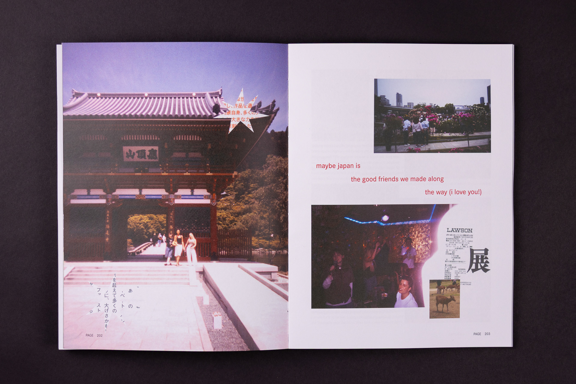
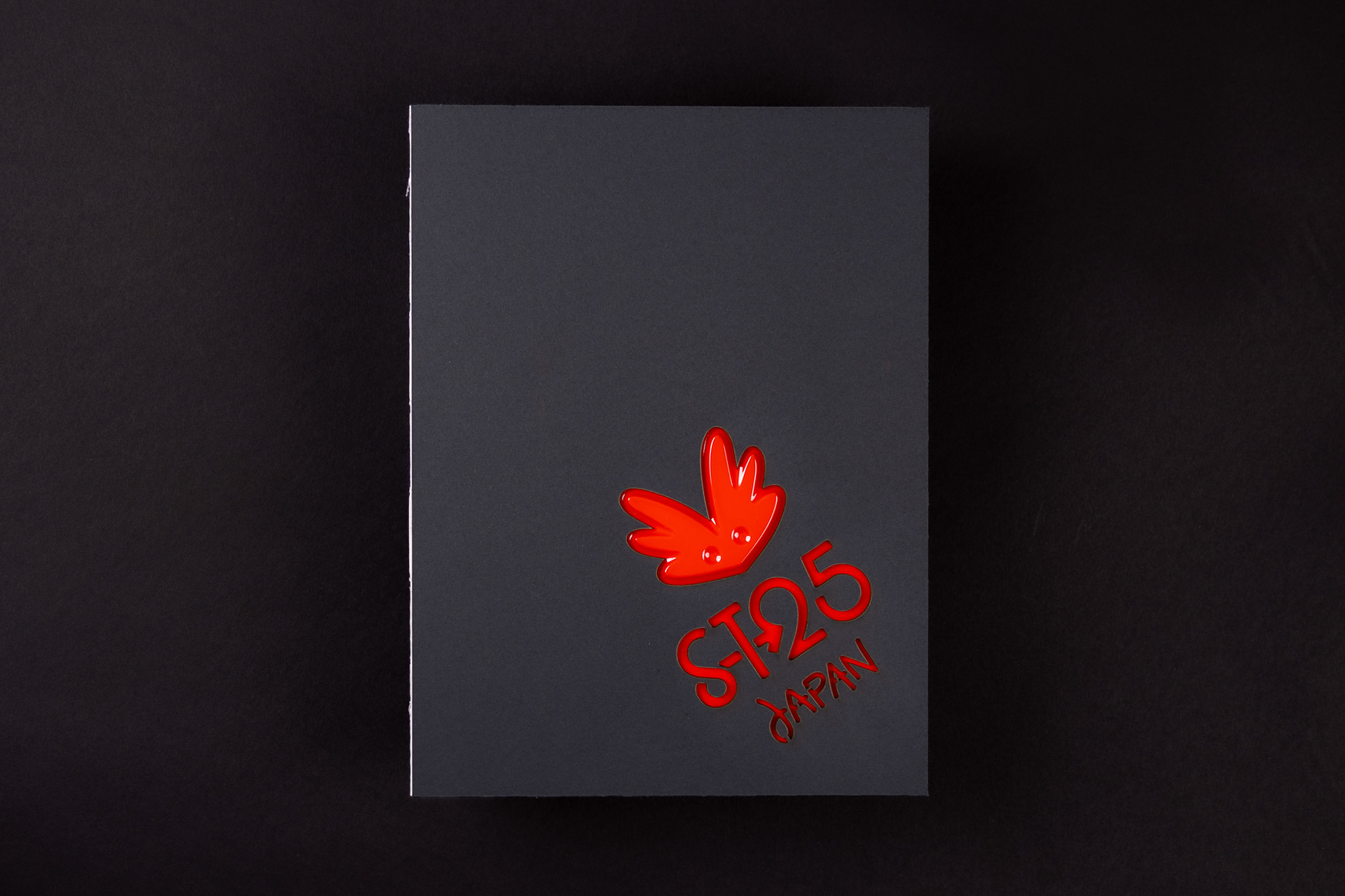
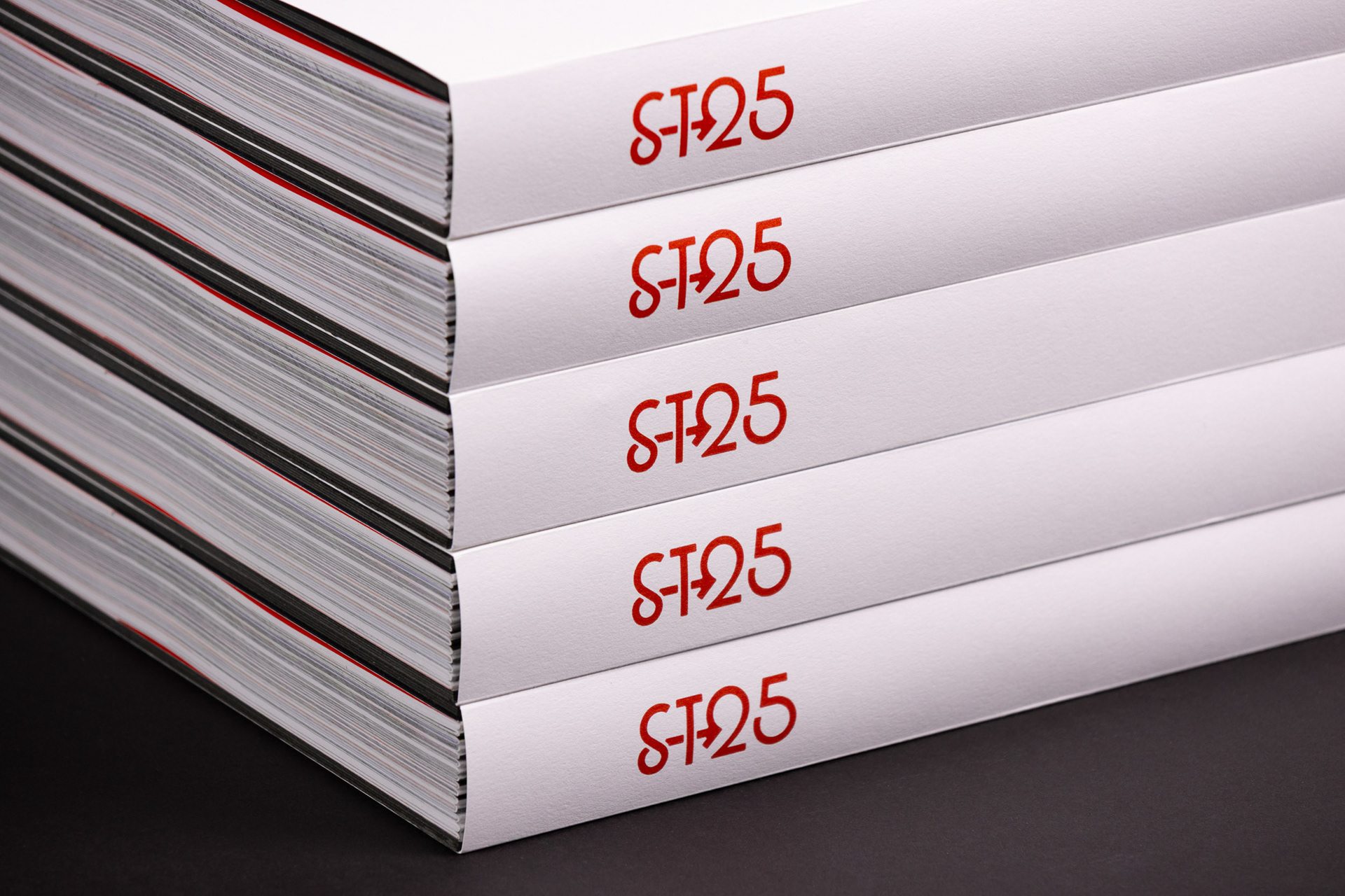
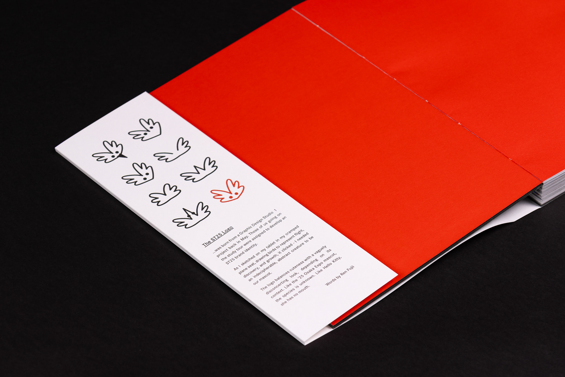
Working within an existing logo and style guide, I extended this identity to include more in-depth type setting and different types of graphics. Reflecting a Japanese sensibility, I chose to keep the typography clean and open. This also provided a grounded style which juxtaposed the graphic content. To call back to the logo, I've used a subtle arrow motif as a section marker.